
How to Choose a Wedding Color Palette That Actually Feels Cohesive
Choosing your wedding colors can feel exciting at first… and then quickly overwhelming.
One minute you love soft neutrals, the next you’re saving bold florals, and suddenly nothing feels like it goes together.
The truth is, a beautiful wedding palette isn’t about picking random colors you like. It’s about creating a direction that feels intentional, layered, and cohesive from start to finish.
Start With the Overall Mood
Before choosing colors, define how you want your wedding to feel.
Soft and romantic
Warm and natural
Light and airy
Rich and dramatic
Your palette should support that feeling.
For example:
A garden wedding might lean into soft greens, muted florals, and warm neutrals
A more editorial design might bring in deeper tones paired with clean, refined bases
There is a benefit or working with a planner who understands design direction. When you focus on the mood first, your color choices become much clearer.
Keep It Simple
The most elevated palettes are not complicated.
A strong wedding palette usually includes:
One or two main colors
One or two supporting tones
A few neutrals to balance everything out
That’s it.
Trying to incorporate too many colors is what makes a design feel scattered instead of cohesive.
Pay Attention to Undertones
This is the detail most people miss.
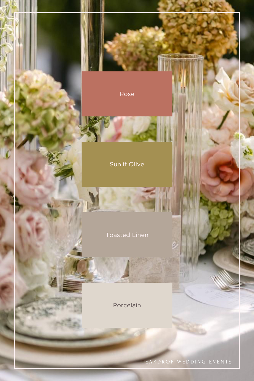
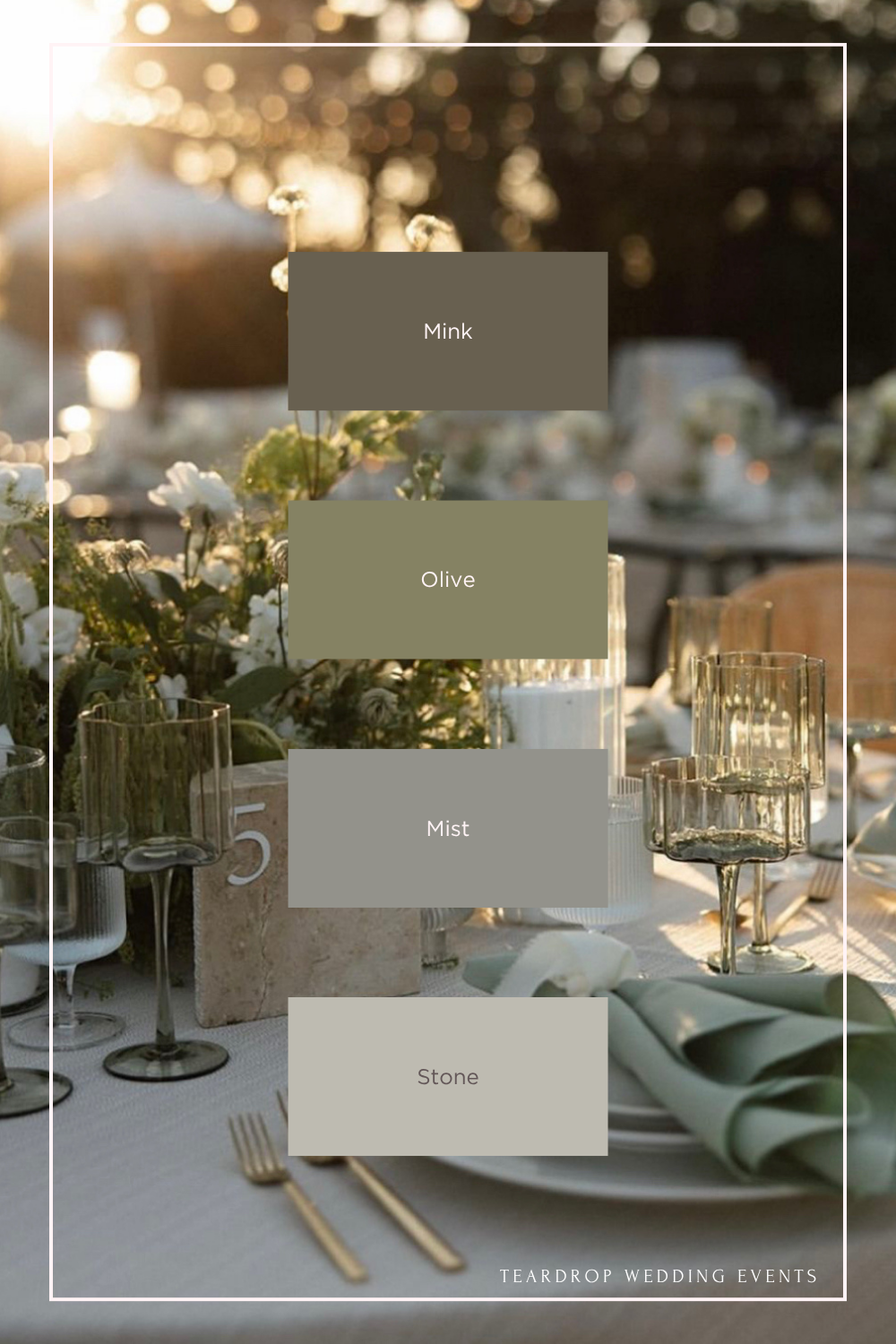
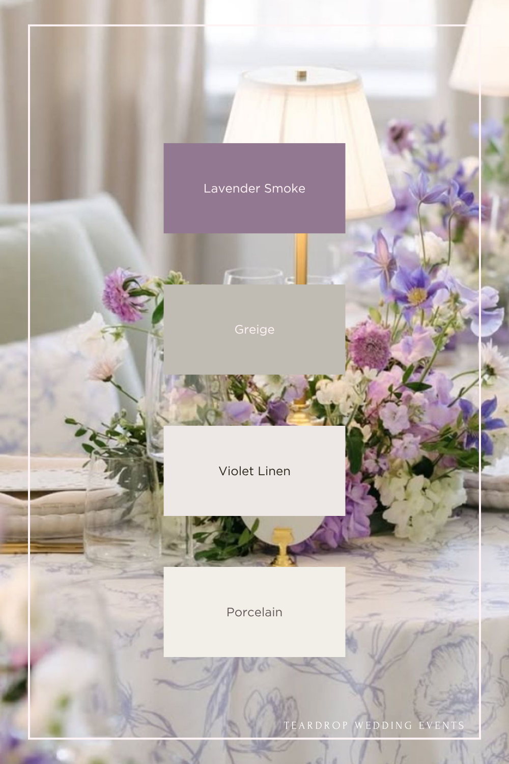
Not all neutrals or greens are the same. Some are warm, some are cool, and some carry subtle undertones that can clash if they’re not considered.
For example:
A warm linen paired with a cool gray can feel disconnected
A soft neutral with a slight lavender undertone can completely shift the look of a palette
When everything shares a similar undertone, the entire design feels seamless.
Browse more wedding design inspiration
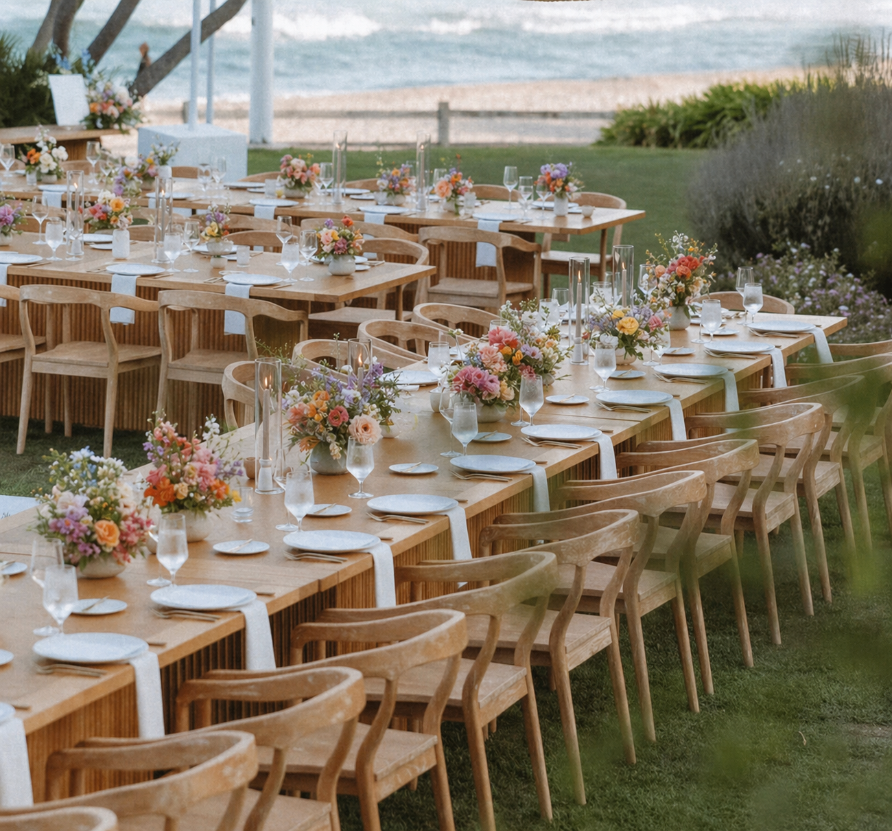
Think Beyond “Matching”
Your wedding does not need to match. It needs to coordinate.
Instead of repeating the exact same color everywhere, think in layers:
Florals bring in variation and movement
Linens create a base tone
Tableware and rentals add depth
Lighting enhances warmth and atmosphere
The goal is a palette that feels collected, not copied.
See how this palette came to life in a real wedding
Let Your Venue Guide You
Your venue already has its own color story, whether you realize it or not.
Gardens and vineyards naturally complement soft greens and warm neutrals
Estate venues can support more layered, textured palettes
Modern spaces often pair best with cleaner, more minimal tones
Working with the environment, instead of against it, makes everything feel more intentional.
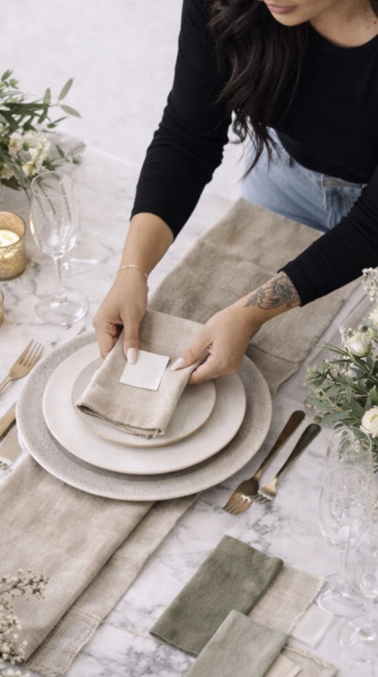
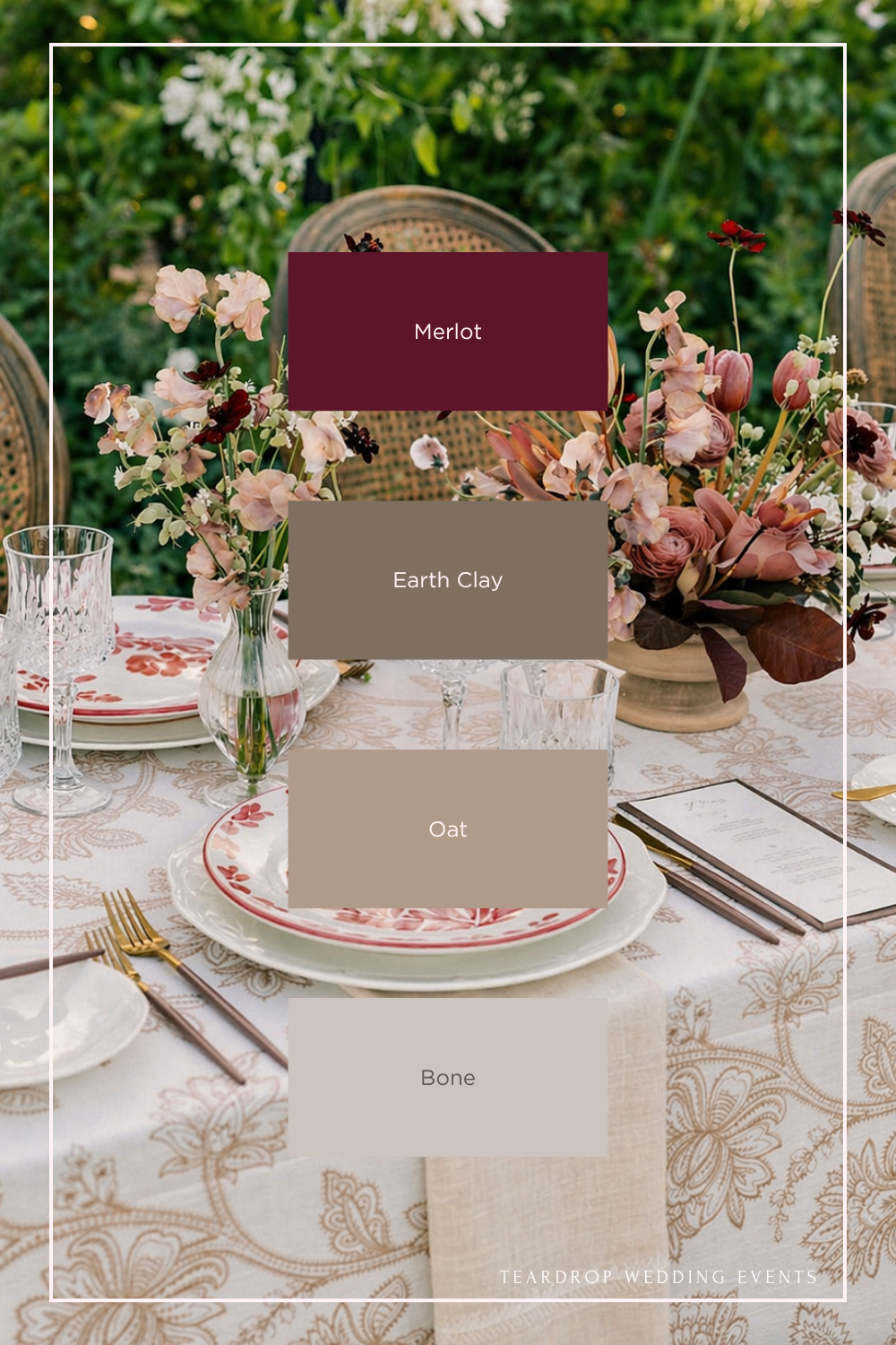
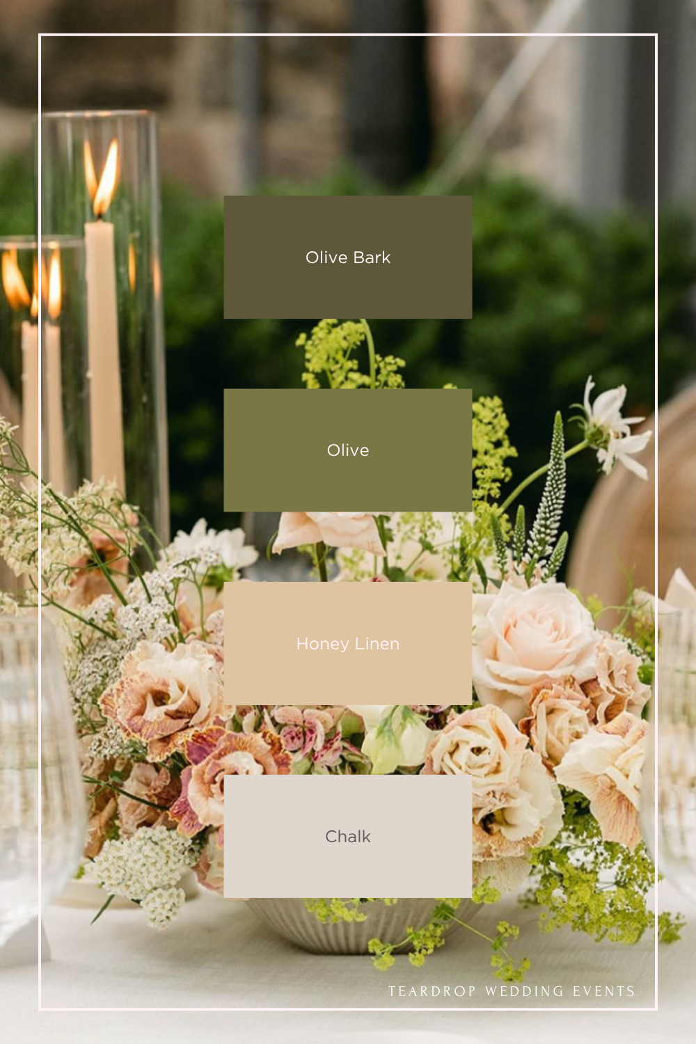
Use Neutrals to Ground the Design
Neutrals are what make a palette feel elevated.
Shades like oat, stone, bone, linen, and clay:
Balance stronger colors
Add softness and dimension
Keep the overall design timeless
Even in more colorful weddings, neutrals are what tie everything together.
Perfect for San Diego venues like this →
Color Is Only Part of the Design
A palette alone doesn’t create a beautiful wedding.
It’s how those colors are applied through:
Texture
Materials
Florals
Lighting
Overall composition
Two weddings can use the same colors and feel completely different depending on how they’re designed.
Bringing It All Together
A well-designed wedding palette doesn’t feel forced or overly styled.
It feels natural. Intentional. Effortless.
When everything is working together, you don’t notice the individual colors. You just feel the overall look and experience.
If you’re in the early stages of planning, use these palette ideas as a starting point to explore what feels right for your day.
And if you want help turning a color direction into a fully designed wedding that actually feels cohesive, that’s where we come in.
Bottom Line
Choosing the right palette is what makes the difference between a wedding that feels disconnected and one that feels fully intentional, especially when you’re working with a planner who understands design direction.
If you’re refining your wedding design, these may help guide your direction: